Back to home
Choose Component ➡️
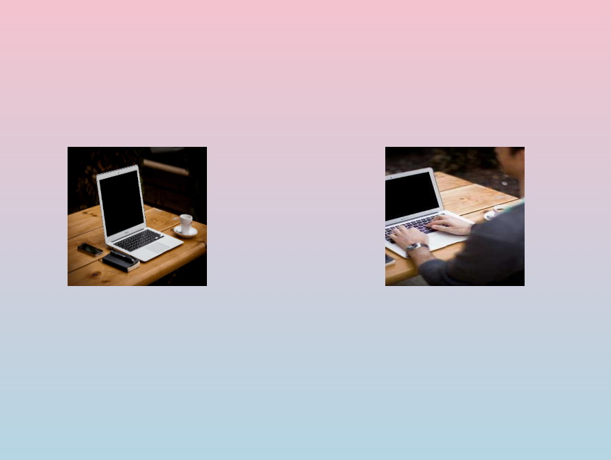
Preview
Code
<!DOCTYPE html> <html lang="en"> <head> <meta charset="UTF-8"> <meta name="viewport" content="width=device-width, initial-scale=1.0"> <title>Image Animation</title> <link rel="stylesheet" href="styles.css"> <style> body { margin: 0; padding: 0; display: flex; justify-content: center; align-items: center; height: 100vh; background: linear-gradient(pink, lightblue); } .container { width: 100%; overflow: hidden; position: relative; height: 10rem; } .container img{ width: 10rem; height: 10rem; z-index: 2; } .animated-image { position: absolute; top: 50%; transform: translateY(-50%); } .tom { left: -20%; animation: moveRight 5s infinite; } .jerry { right: -20%; animation: moveLeft 5s infinite; } @keyframes moveRight { 0% { left: -20%; } 50% { left: 40%; } 100% { left: 70%; } } @keyframes moveLeft { 0% { right: -20%; } 50% { right: 40%; } 100% { right: 70%; } } </style> </head> <body> <div class="container"> <img src="https://fastly.picsum.photos/id/1/200/300.jpg?hmac=jH5bDkLr6Tgy3oAg5khKCHeunZMHq0ehBZr6vGifPLY" alt="Tom" class="animated-image tom"> <img src="https://fastly.picsum.photos/id/0/5000/3333.jpg?hmac=_j6ghY5fCfSD6tvtcV74zXivkJSPIfR9B8w34XeQmvU" alt="Jerry" class="animated-image jerry"> </div> </body> </html>
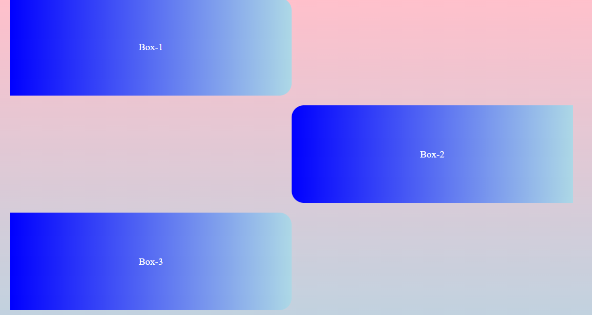
Preview
Code
<!DOCTYPE html> <html lang="en"> <head> <meta charset="UTF-8"> <meta name="viewport" content="width=device-width, initial-scale=1.0"> <title>Image Animation</title> <link rel="stylesheet" href="styles.css"> <style> body { margin: 0; padding: 0; display: flex; justify-content: center; align-items: center; height: 100vh; background: linear-gradient(pink, lightblue); } .container { width: 100%; overflow: hidden; position: relative; height: 100vh; } .container img{ width: 10rem; height: 10rem; z-index: 2; } .animated-image { position: absolute; top: 50%; transform: translateY(-50%); } .container > div{ position: absolute; width: 30%; height: 10rem; background:linear-gradient(90deg,blue, lightblue); border-radius: 0px 20px 20px 0px; display: flex; align-items: center; justify-content: center; color: white; } .container > div:nth-of-type(2), .container > div:nth-of-type(4){ border-radius: 20px 0px 0px 20px; } .container > div:nth-of-type(1){ top: 0px; left: 0px; } .container > div:nth-of-type(2){ top: 11rem; right: 0px; } .container > div:nth-of-type(3){ top: 22rem; left: 0px; } .container > div:nth-of-type(4){ top: 33rem; right: 0px; } .container > div:nth-of-type(1){ left: -20%; animation: moveRight 5s infinite; } .container > div:nth-of-type(3){ left: -20%; animation: moveRight 5s infinite; } .container > div:nth-of-type(2) { right: -20%; animation: moveLeft 5s infinite; } .container > div:nth-of-type(4) { right: -20%; animation: moveLeft 5s infinite; } @keyframes moveRight { 0% { left: -20%; } 50% { left: 20%; } 100% { left: 20%; } } @keyframes moveLeft { 0% { right: -20%; } 50% { right: 20%; } 100% { right: 20%; } } </style> </head> <body> <div class="container"> <div>Box-1</div> <div>Box-2</div> <div>Box-3</div> <div>Box-4</div> </div> </body> </html>
Preview
Code
<!DOCTYPE html> <html lang="en"> <head> <meta charset="UTF-8"> <meta name="viewport" content="width=device-width, initial-scale=1.0"> <title>Document</title> <link rel="stylesheet" href="./styles.css"> <style> * { margin: 0px; box-sizing: border-box; font-family: sans-serif; } .cont { width: 100vw; height: 100vh; } .cont > .cont1 { width: 100%; height: 70%; display: flex; } .cont > .cont1 > .left { width: 45%; height: 100%; background-color: darkblue; display: flex; align-items: center; } .cont > .cont1 > .left > img { margin-left: 25%; } .cont > .cont1 > .right { width: 55%; height: 100%; background-color: rgb(64, 64, 216); display: flex; color: white; align-items: start; justify-content: space-around; } .cont > .cont1 > .right > ul { display: flex; flex-direction: column; justify-content: space-around; list-style: none; margin-top: 3rem; margin-bottom: 3rem; } .cont > .cont1 > .right > ul > li { margin: 1rem 0px; font-size: 14px; font-weight: 100; } .cont > .cont1 > .right > ul > li:nth-of-type(1) { font-weight: 700; font-size: 1.2rem; } .cont > .cont2 { width: 100%; height: 30%; background-color: black; color: white; display: flex; align-items: center; justify-content: space-between; } .cont .cont2 .left { margin-left: 2rem; } .cont .cont2 .right { margin-right: 2rem; } .cont .cont2 .right > span { text-decoration: underline; } @media (min-width: 425px) and (max-width: 1000px) { .cont > .cont1 { display: flex; flex-direction: column; } .cont > .cont1 > .right { width: 100%; height: 55%; order: -1; } .cont > .cont1 > .right > ul { margin-top: 1rem; margin-bottom: 1rem; } .cont > .cont1 > .right > ul > li { margin: 7px 0px; } .cont > .cont1 > .left { width: 100%; height: 45%; justify-content: center; } .cont > .cont1 > .left > img { height: 80%; margin-left: 0px; } .cont > .cont2 { justify-content: center; } .cont .cont2 .left { margin-left: 2rem; display: none; } } </style> </head> <body> <div class="cont"> <div class="cont1"> <div class="left"> <img src="https://fastly.picsum.photos/id/800/200/200.jpg?hmac=imZ9apEK2ZrSqIrWpccZeiEbLsyJaN_nx3VrxgTkBBI" alt=""> </div> <div class="right"> <ul> <li>Shop</li> <li>Gift Cards </li> <li>Etsy Registry</li> <li>Sitemap</li> <li>Etsy blog</li> <li>Etsy United Kingdom</li> <li>Etsy Germany</li> <li>Etsy Canada</li> </ul> <ul> <li>Sell</li> <li>Sell on Etsy </li> <li>Team</li> <li>Forums</li> <li>Affiliates and Creator</li> </ul> <ul> <li>About</li> <li>Gift Cards </li> <li>Etsy Registry</li> <li>Sitemap</li> <li>Etsy blog</li> <li>Etsy United Kingdom</li> <li>Etsy Germany</li> <li>Etsy Canada</li> </ul> <ul> <li>Shop</li> <li>Gift Cards </li> <li>Etsy Registry</li> <li>Sitemap</li> <li>Etsy blog</li> <li>Etsy United Kingdom</li> <li>Etsy Germany</li> <li>Etsy Canada</li> </ul> </div> </div> <div class="cont2"> <div class="left">India | English(IN) | ₹(INR)</div> <div class="right"> © 2024 Etsy, Inc. <span>Term of Use</span> <span>Privacy </span> <span>Intereseted-based ads </span> <span>Local Shops </span> <span>Regions</span> </div> </div> </div> </body> </html>
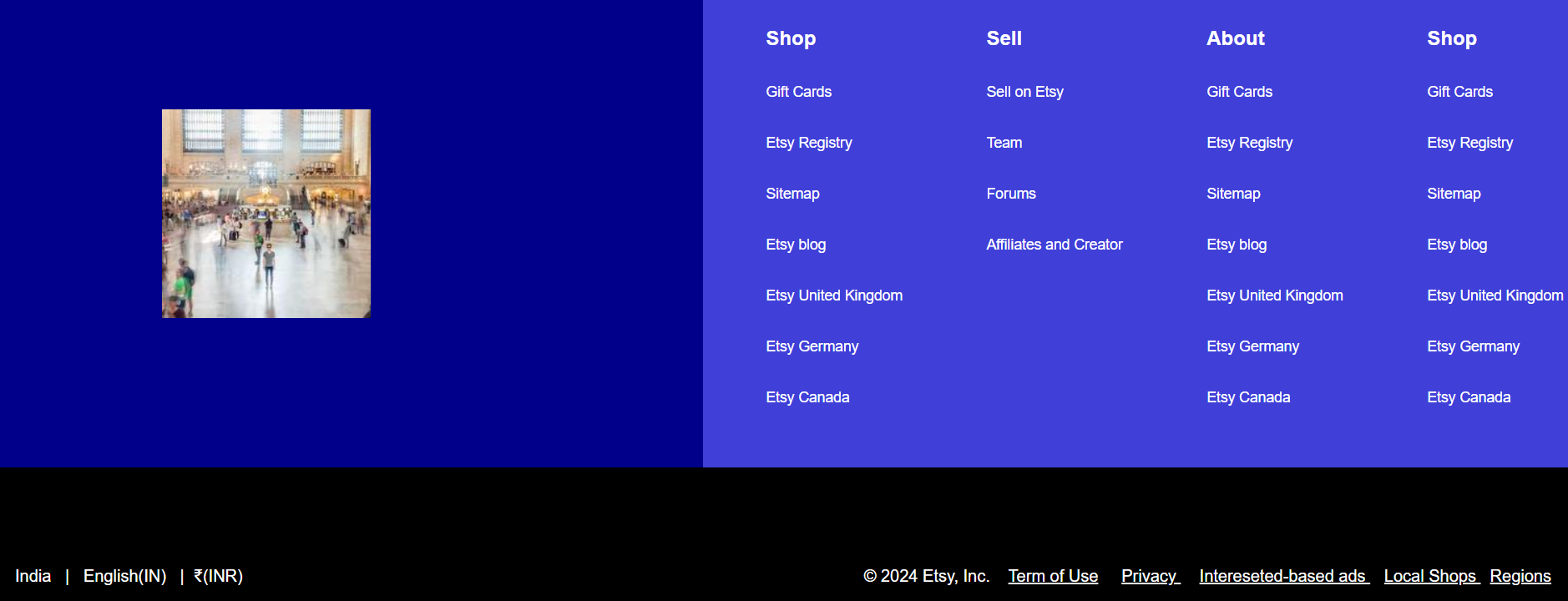
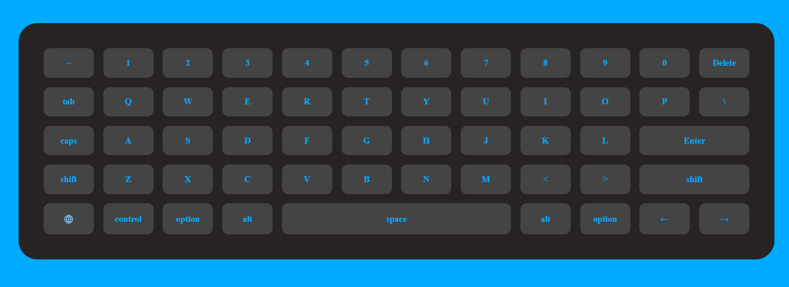
Preview
Code
<!DOCTYPE html> <html lang="en"> <head> <meta charset="UTF-8"> <meta name="viewport" content="width=device-width, initial-scale=1.0"> <title>CSS Grid Keyboard</title> <link rel="stylesheet" href="styles.css"> <style> body { display: flex; justify-content: center; align-items: center; height: 100vh; margin: 0; background-color: #00aaff; /* font-family: Arial, sans-serif; */ } .keyboard { display: grid; grid-template-columns: repeat(12, 80px); gap: 15px; padding: 40px; background-color: rgb(40, 35, 35); border-radius: 30px; } .key { display: flex; justify-content: center; align-items: center; background-color: #444; color: #00aaff; font-size: 14px; border-radius: 10px; font-weight: 900; padding: 15px 10px; } /* .key:nth-of-type(35){ grid-area: span; } */ .enter { grid-column: span 2; } .shift { grid-column: span 2; } .space { grid-column: span 4; } .globe { grid-column: span 2; } </style> </head> <body> <div class="keyboard"> <div class="key">~</div> <div class="key">1</div> <div class="key">2</div> <div class="key">3</div> <div class="key">4</div> <div class="key">5</div> <div class="key">6</div> <div class="key">7</div> <div class="key">8</div> <div class="key">9</div> <div class="key">0</div> <div class="key">Delete</div> <div class="key">tab</div> <div class="key">Q</div> <div class="key">W</div> <div class="key">E</div> <div class="key">R</div> <div class="key">T</div> <div class="key">Y</div> <div class="key">U</div> <div class="key">I</div> <div class="key">O</div> <div class="key">P</div> <div class="key">\</div> <div class="key">caps</div> <div class="key">A</div> <div class="key">S</div> <div class="key">D</div> <div class="key">F</div> <div class="key">G</div> <div class="key">H</div> <div class="key">J</div> <div class="key">K</div> <div class="key">L</div> <div class="key enter">Enter</div> <div class="key">shift</div> <div class="key">Z</div> <div class="key">X</div> <div class="key">C</div> <div class="key">V</div> <div class="key">B</div> <div class="key">N</div> <div class="key">M</div> <div class="key"><</div> <div class="key">></div> <div class="key shift">shift</div> <div class="key">🌐</div> <div class="key">control</div> <div class="key">option</div> <div class="key">alt</div> <div class="key space">space</div> <div class="key">alt</div> <div class="key">option</div> <div class="key">←</div> <div class="key">→</div> </div> </body> </html>